Advanced Portfolio-Chloe Ravenscroft 1325
Monday, 11 February 2013
A2 Media - Directors commentary
This is our Directors commentary . Explaining the processes we went through whilst creating our media production.
A2 Music video- The Pretty Reckless
Here is or music video, Make me wanna die by The Pretty Reckless.
Wednesday, 9 January 2013
Final Print Artefacts and CD cover
After much consideration as a team we decided to re invent our advert and CD cover in order to give the whole much more realistic look, we decided to add more images to the Cd cover and overall give it a polished professional look both the advert and the CD print artifact.Here are our final designs.
This is the front image of our CD cover we decided to take inspiration from our original design we created in pre production. We created a split face to show the girl in the music videos split personality due to her schizophrenia. The glass covering the image signifies this girls unstable perception of herself. This being she does not know whether she is the left hand side of the face or the right . We channelled the personalities of the two characters in our music video "You make me wanna die" through the use of eyes and their colour. The left side of the face contains a blue eye to signify purity and goodness, the right hand side contains a dark, red eye to signify the evil within the girls alter ego. We used the imagery of eyes in order to convey the girls personalities as the eye is said to be the window to the soul. We also used red bold font for the album name "Light me up" and the artists name "The Pretty Reckless" in order to keep in convention with the album name. This is because the rest of the page apart from the front contains dark and bleak colours. Therefore the writing literally "lights" up the page and gives the front image colour and light.
This is the back of our album cover. We decided again on the use of dark , dull colours in order to mirror the dark undertone of the whole album as well as our music video "Make me wanna die". We took inspiration from the likes of Adele and her CD imagery in order to keep in convention with the traditional CD design of the singer/artist being on their own album cover. We also added a bar code , the record label logo and the small print found on all music albums in order to make our CD print artifact look authentic and realistic as well as professional . We again used red bold font for the album song list in order to keep in line with the album title "Light me up" but also to keep in convention with the idea of death and decay suggested by handful of songs on the album e.g Make me wanna die ... Light me up , as the colour red holds connotations of blood and harm.
Here is the centre image of are CD album sleeve . We used this iconic image of an eye to keep in line with the theme of the main character having a distorted image of herself. Something which hinted at by all the images present on our CD cover. For example the glass covering the eye represents the distorted, broken image the main character in the music video has of herself and how she literally is a broken woman. The bright fluorescent blue covering the eye hints at the girls unstable mind frame as the colouring is unnatural and fake suggesting she is living in a parallel universe to reality .
Here is the outer case and sleeve of our CD cover. As you can see the colours are very dim and bleak and mainly grey and blue centred and orientated. We did this in order to create a metaphor for the girl in the music videos. On the outside she seems completely ordinary and mundane as schizophrenia allows you to look on the outside to others completely normal and stable.
This is the inside sleeve of our CD cover. We decided to contrast the inside sleeve with the outside CD sleeve. As you can see opposed to the dull blues and greys present on the outside of the CD , the inside sleeve is multicoloured , bright and fluorescent . We used such colours to mirror the narrative of our music video. How the girls life and personality is constantly fluctuating. On the outside to others she is normal , mundane and highly stable minded . However on the inside she is exploding and fully distorted and she is so far from reality. Hence the explosion of colour shown on the picture above .As you can see we have integrated the same eye image used on the front cover into the inside sleeve. We have also used the screen grab, from our music video, of the girl transforming from one personality to the next . We did this in order to make a conventional link between the CD cover and our media production . This is a convention many artists use. This being they take images from their other art work e.g music videos and integrate the iconic imagery into other aspects of their work e.g their CD poster or Cd covers , like we have done here for our own CD cover . We also used the image of the eye for the centre image of the inside sleeve as it makes an effective place to put the actual round CD inside. We also added tiny snippets of lyrics taken from the song "Make me wanna die". We added this feature as many albums also add a little insight into the albums contents and it allows fans a little guide to the feel and lyrics present in the album and it's hit single "Make me wanna die".
This is our second print artifact our CD advertisement poster. We decided to use the abstract image we created for the CD cover , for our poster (the split face) in order to keep consistent with the theme of the music video and the album itself. However we adapted the image in order for it to contain one blue side of a face and the other red. We used colour in such an extreme way as a posters main purpose is to draw people in and catch their attention . Such vivid colours serve this purpose. The colours used also contain deep meaning. The blue represents the girl in the our music videos good side, her virtuous purity as the colour blue contains such connotations. Whereas the red side of the face signifies the girls evil alter ego who causes no more than death and destruction . The colour red creates connotations of death and bloodshed . We decided to add flames over the image present in order to draw on the lyrics of the song "You make me wanna die" into the advertising section of the song and CD cover. This is because the song contains the frequent line "Burn up in the light". This is something the girl in the music videos life is literally doing. Her personality and virtue is being destroyed by her schizophrenia . It is turning her into a monster. We also added the conventional factors to the poster such as the CD cover itself so it is clear what the product we are attempting to sell is. We also added the conentionsl price , star rating and quote in reference to the album to give the poster a professional finish not to mention the conventional HMV logo too. We added a quote from Kerrang radio as it is specialist in rock music and our music video fits into this particular category and genre. We laid out the album name and the artists name in a way to signify the divided feel of the album alot of the songs on the album contain a dark theme whereas others are more light hearted . Therefore the artists name down the centre mirrors this feel to the album as like the page is deliberately split so is the feel of the album. Not to mention the girls split personality in the music video.
Wednesday, 28 November 2012
Print Artefacts - The creation
After finishing our music video production in class . We were faced with designing various print artefact's to compliment our music video . This took a while as in order to achieve our final print artefact's, this being a CD advert , and a CD front and back cover we had to experiment with various different ideas in order to achieve the best look possible for our CD artwork and advert.
firstly we decided to focus all our artwork on combining the two lead singers in the production ,faces together. We used various apps on apple IPAD in order to achieve this . Below are the images we started with and the image we achieved after.
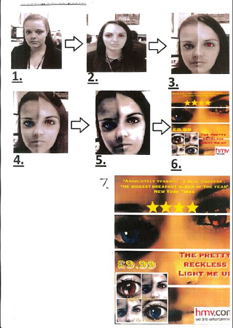
Step by step guide to making our CD poster

firstly we decided to focus all our artwork on combining the two lead singers in the production ,faces together. We used various apps on apple IPAD in order to achieve this . Below are the images we started with and the image we achieved after.
Step by step guide to making our CD poster
Here i have demonstrated in a step by step guide how my group created our final CD poster promoting The Pretty Reckless album "Light me up". Both the images of step one and two in our poster creation illustrates how we started of by taking pictures of the two main characters in our music video, the good and the bad alter ego on an IPAD .We then uploaded these images to a laptop in order to edit the two photos on photo shop so we could create a face mash up of the two characters in the music video. We created this specific image to mirror the narrative of the storyline, this being that these two people are actually one stand alone person. We also made this iconic image as ideally these two performers in the music video could in fact be the band members of The Pretty Reckless. Therefore by displaying the face image on the CD poster, people will be aware instantly of who's CD HMV are promoting and therefore this could alone draw them in to by the CD . We then transferred the image back on to the IPAD ,as shown in step 4, and removed any blemishes of the photo to give the image a professional feel. Then using various apps on the IPAD we played with various darkening effects in order to get an image that truly reflected the dark rock feel behind the album itself. Using an IPAD app we also changed the eye colour of each eye. Are end image contains one red eye and one blue as shown in step five in order to highlight the idea of the two performers portraying good and evil colliding . Blue being good and red evil due to various connotations. We also lit up the eyes to keep in line with the album title "Light me up." This is because the eyes are the only part of the face we have highlighted in the image which in turn suggests the eyes are the window to the soul, one soul embodying good the other evil. Step 5 also shows the dutch tilt we added to the iconic face image . We did this in order to give a sense of realism to the image , so people would believe the image is in fact only one person .Finally as step 6 illustrates we tried out various different texts and logo styles on our CD poster and after various considerations we decided on an overall style whilst keeping in convention with CD posters e.g we edited in an image of hmv advertising and also the CD cover itself has various quotes about the album and a star rating something you will find on all album posters.
Step by step guide to creating our CD back and front cover

When making our CD cover we decided to take the background image from our CD poster of the face collision,to demonstrate relevance to the narrative of our music video, "You make me wanna die" and to keep in line with a popular convention of CD covers ; having the band on the front of the CD as to make it instantly recognisable to fans and customers. As step 2 and 3 shows , we decided to take close up shots of the good and evil eyes of the two performers in the music video . We decided upon this mainly due to the feel of the album. It contains a mixture of dark and light songs in terms of meaning and emotion e.g. from love to hate. Therefore the two different colour eyes are symbolic of the good and bad feel of the album as well as the two characters in our music video. By step 4 we decided to integrate these four images together using an IPAD app in order to collaborate all our various meaningful ideas together. We then added the title of the album "Light me up" an the band name to the image. We did this to keep in line with CD conventions. We were then faced with the issue of creating the back of the CD sleeve. We decided to take inspiration from the likes of artists such as Adele and The Pretty Reckless themselves, who on one or more of their albums have one simplistic image. We decided on this as we did not want to busy the page with unneeded detail and for the customers sake as we do not want to draw them away from the main purpose of the back of the CD sleeve . This being the illustration of the song list . We chose an image of the lead singer of our created "band". We tried out various styles as show in steps 5 to 6 and after facing issues such as over crowed space and contrasting colours we decided upon our final back cover containing yellow bold writing. This makes the writing easy and simple to read. we then added the conventional bar code and copyright info in small print along with the interscope logo in order for our CD sleeve to look realistic and saleable. Then we combined the image with our front cover created previously.
Saturday, 6 October 2012
Cd cover
Today in media we decided to experiment with different cd front covers for our music video here is one of the examples we came up with.
Friday, 5 October 2012
Production schedule 1
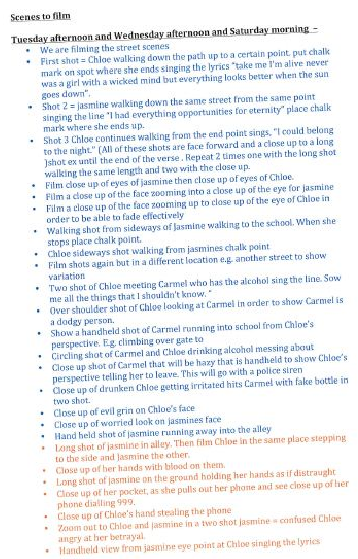
Today in Lesson our group made a production schedule in order to visually show where and when we need to film certain scenes . We did this so the filming process would be as quick and as smooth running as possible and so there was no time wasting.
Production schedule 2
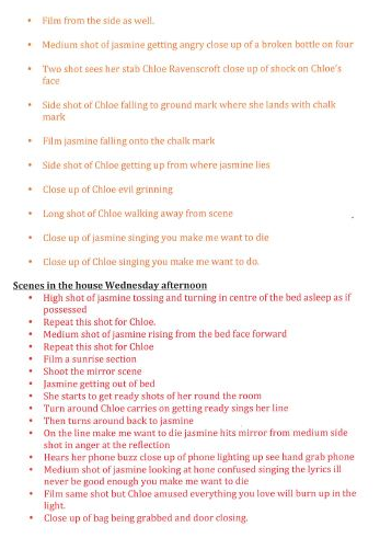
In our group today we also decided to plan each step by step shot out so we were fully organised when it came to filming our music video .
Subscribe to:
Comments (Atom)


