firstly we decided to focus all our artwork on combining the two lead singers in the production ,faces together. We used various apps on apple IPAD in order to achieve this . Below are the images we started with and the image we achieved after.
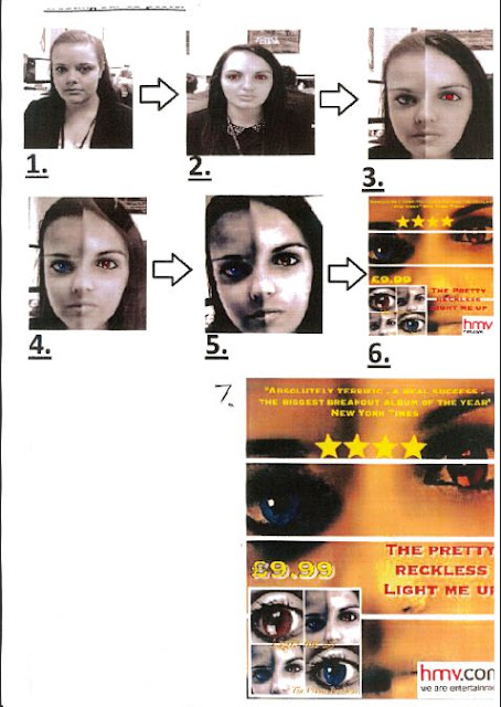
Step by step guide to making our CD poster
Here i have demonstrated in a step by step guide how my group created our final CD poster promoting The Pretty Reckless album "Light me up". Both the images of step one and two in our poster creation illustrates how we started of by taking pictures of the two main characters in our music video, the good and the bad alter ego on an IPAD .We then uploaded these images to a laptop in order to edit the two photos on photo shop so we could create a face mash up of the two characters in the music video. We created this specific image to mirror the narrative of the storyline, this being that these two people are actually one stand alone person. We also made this iconic image as ideally these two performers in the music video could in fact be the band members of The Pretty Reckless. Therefore by displaying the face image on the CD poster, people will be aware instantly of who's CD HMV are promoting and therefore this could alone draw them in to by the CD . We then transferred the image back on to the IPAD ,as shown in step 4, and removed any blemishes of the photo to give the image a professional feel. Then using various apps on the IPAD we played with various darkening effects in order to get an image that truly reflected the dark rock feel behind the album itself. Using an IPAD app we also changed the eye colour of each eye. Are end image contains one red eye and one blue as shown in step five in order to highlight the idea of the two performers portraying good and evil colliding . Blue being good and red evil due to various connotations. We also lit up the eyes to keep in line with the album title "Light me up." This is because the eyes are the only part of the face we have highlighted in the image which in turn suggests the eyes are the window to the soul, one soul embodying good the other evil. Step 5 also shows the dutch tilt we added to the iconic face image . We did this in order to give a sense of realism to the image , so people would believe the image is in fact only one person .Finally as step 6 illustrates we tried out various different texts and logo styles on our CD poster and after various considerations we decided on an overall style whilst keeping in convention with CD posters e.g we edited in an image of hmv advertising and also the CD cover itself has various quotes about the album and a star rating something you will find on all album posters.
Step by step guide to creating our CD back and front cover

When making our CD cover we decided to take the background image from our CD poster of the face collision,to demonstrate relevance to the narrative of our music video, "You make me wanna die" and to keep in line with a popular convention of CD covers ; having the band on the front of the CD as to make it instantly recognisable to fans and customers. As step 2 and 3 shows , we decided to take close up shots of the good and evil eyes of the two performers in the music video . We decided upon this mainly due to the feel of the album. It contains a mixture of dark and light songs in terms of meaning and emotion e.g. from love to hate. Therefore the two different colour eyes are symbolic of the good and bad feel of the album as well as the two characters in our music video. By step 4 we decided to integrate these four images together using an IPAD app in order to collaborate all our various meaningful ideas together. We then added the title of the album "Light me up" an the band name to the image. We did this to keep in line with CD conventions. We were then faced with the issue of creating the back of the CD sleeve. We decided to take inspiration from the likes of artists such as Adele and The Pretty Reckless themselves, who on one or more of their albums have one simplistic image. We decided on this as we did not want to busy the page with unneeded detail and for the customers sake as we do not want to draw them away from the main purpose of the back of the CD sleeve . This being the illustration of the song list . We chose an image of the lead singer of our created "band". We tried out various styles as show in steps 5 to 6 and after facing issues such as over crowed space and contrasting colours we decided upon our final back cover containing yellow bold writing. This makes the writing easy and simple to read. we then added the conventional bar code and copyright info in small print along with the interscope logo in order for our CD sleeve to look realistic and saleable. Then we combined the image with our front cover created previously.

No comments:
Post a Comment